Errors and upgrades
The wrong error message can send a user scurrying, while the right message can turn lemons into lemonaid.
Bill.com upgrade
Telling the user they can’t do something because they don’t have a paid or “upgraded”account, can be frustrating. So turning a potentially frustrating experience into an opportunity, is truly the type of experience that gives content designers their value.
Requested Feature: Change the error message on the pop up modal when a basic plan user tries to initiate a payment to a basic plan vendor….meaning that either the user has to upgrade their account, or the vendor.
Role: Senior Content Designer.
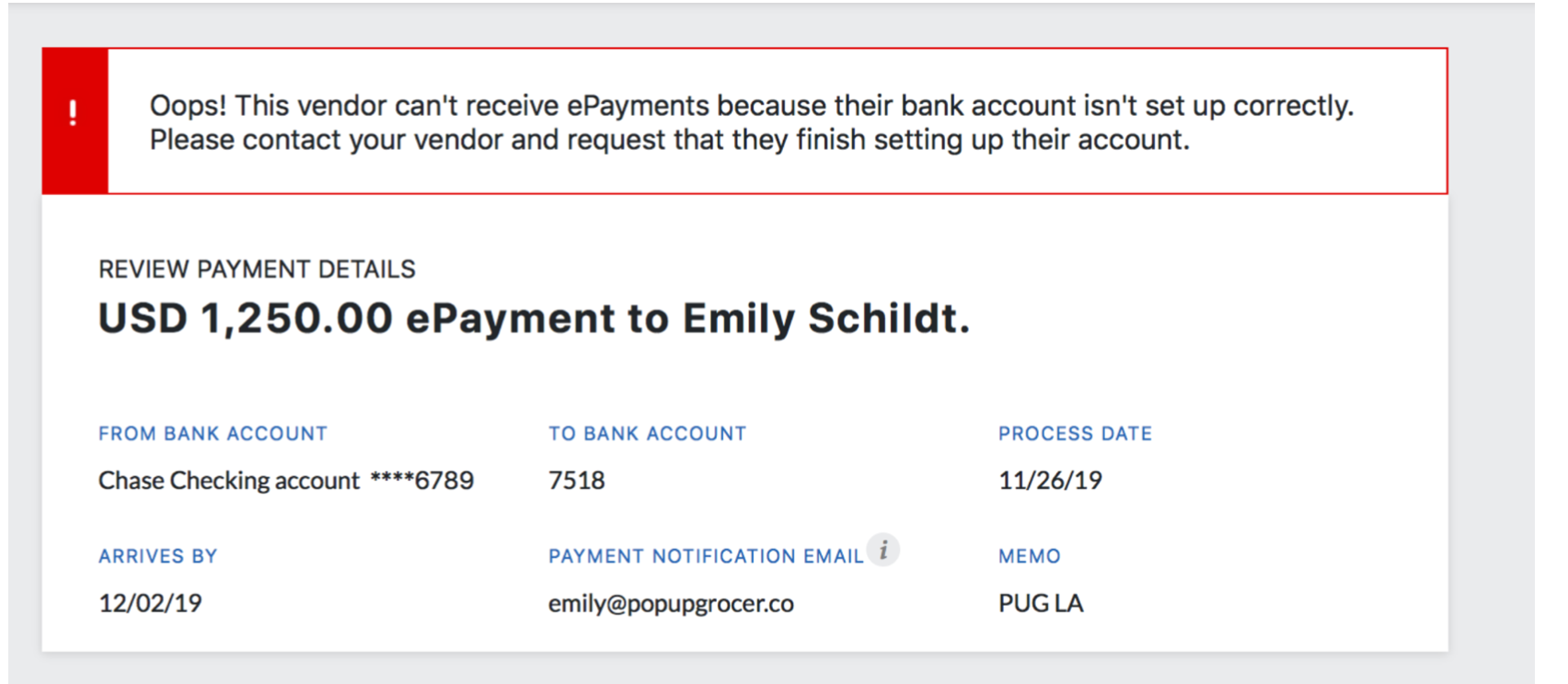
The previous design:
Disregarding the unnecessary exclamation point in the payment details, the error message is confusing, and doesn’t give the user an opportunity to resolve the issue, unless they contact support. If I’m a user, I would just not pay this vendor, due to the complexity involved.
Engineer’s suggestion:
The engineer’s suggestion might have a little more detail, but lacks the human connection and clear resolution that we need to steer the user to. It also doesn’t make it clear that the user can upgrade their account to make a payment.
My initial approach:
Turning a negative experience into an opportunity, my initial treatment has a clear CTA (call to action) to allow the user to know what the recommended solution is. The problem statement, action, and path to solve the issue is clear.
However, the design team came back and said the CTA in the banner isn’t allowed with our current design system, so I had to sacrifice some of the approach.
Final solution:
Because there were design system limitations, we went with the most straight-forward, concise, and clear approach. By being clear on what the user needs to do to make the payment, we’re taking out a lot of the guesswork.
Result: Enabling the plan upgrade via the UI, and improving the messaging, we reduced the monthly call driver volume over plan upgrades by 10%.
Class Project: Knowmad Error Messagee
For my General Assembly app project, I created an error page for any missing or broken content. Because it’s my own app and I get to choose my own voice/tone, here’s what I created.
Strategy
I want users to enjoy the experience of using the app, using lighthearted, playful language to communicate information. This makes it simple to understand that there’s an error, while giving them direction as to where to go next.
Because it’s an app related to traveling, I used imagery of a hiking trail to illustrate the point.


